Rainier Medical Spa
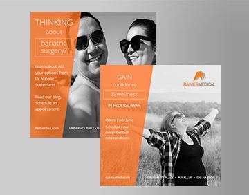
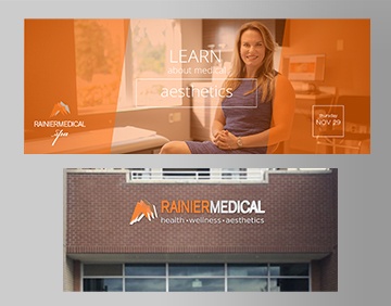
We helped launch Rainier Medical with the bold branding of a repeated "R" in the layered mountain, reminiscent of Mt. Rainier, and of the climb for clients to achieve medical weight loss and wellness with a positive, invigorating outlook. Inspiring messaging, "take back your health" and "reach your peak" repeat itself throughout the print and online advertising we helped establish with the founder of the practice, Valerie Sutherland, MD, a Diplomate of both Obesity Medicine and Internal Medicine. The orange with copper color launched into the development of extensive marketing – company websites, corporate identity program, print ads, launch cards, rack cards, outdoor banners, newsletters, and indoor & outdoor signage. All focused on the inviting, professional feel of the medical practice. Additionally, the use of script font for her spa and aesthetic services further softens the look. Within one year, Dr. Sutherland successfully created a medical weight loss, wellness, and aesthetic business where she had over 100 patients on treatment, losing over a combined total of 7,500 pounds and has plans for a second office.
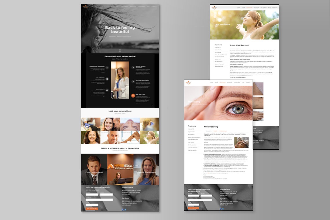
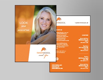
Correlating to her brick and mortar, Dr. Sutherland brought access to her Rainier Medspa through a contemporary, appealing website that we also developed. We strove to inspire a sense of personal freedom in our slogan, "Back to feeling beautiful. The user-friendly architecture of the site allowed patients to define their idea of beauty and identify state-of-art, non-surgical services to that end. Design Centric art-directed the original photography, depicting the welcoming nature of Dr. Sutherland's team and practice. The bold and empowering messaging of the site complemented her other Health & Fitness website in addition to branding of 5 wellness and medical offices. A clean, stylized Medspa brochure also unfolded the ways to "look one's personal best," another message we created, through concise explanations of skin, facial and vascular treatments, and more.